

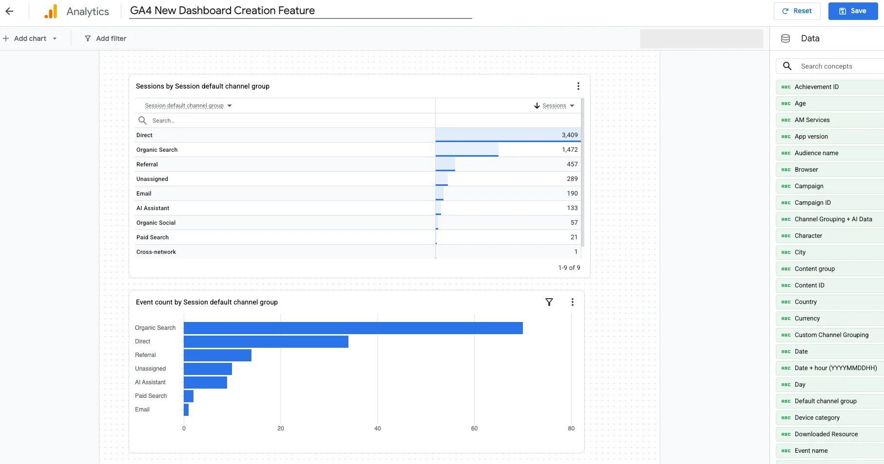
I opened ours. Reports → Create → Dashboard. Named it GA4 New Dashboard Creation Feature. Dragged Session default channel group onto the canvas.
Direct: 3,409 sessions. Organic Search: 1,472. Paid Search: 21.
That is the same story we already published. Direct is where source goes to die. The new dashboard made it faster to see. It did not change the diagnosis.
Google shipped customizable Dashboards the week of September 9, 2026. Grid canvas. Six chart types. Publish into Reports. For anyone who lives in GA4, that is a real improvement.
It is not a reporting system.
A dashboard is the last step, not the first. We have been saying that in custom reports, Explorations, and Looker Studio for years. This post is the judgment on the new native builder: what it is good for, what it still cannot do, and when our Looker Studio work still belongs in the stack.
What Google actually shipped
Dashboards are a new report type inside GA4. You place cards on a grid, resize them, and publish the result into the Reports navigation so anyone with property access can open it.
Chart types at launch:
- Scorecards
- Tables
- Line charts
- Bar charts
- Donut charts
- Funnels
Dimensions and metrics drag onto the canvas. Filters can sit on the whole board or on one card. If you have used Looker Studio, the muscle memory is close.
The limits matter as much as the canvas:
- Standard properties: 15 cards. Analytics 360: 30.
- Editor or Administrator to create and publish. Viewers can look. They cannot build.
- Published boards are property-wide. There is no private scratch pad. The moment you publish, everyone with access can see it.
- No segments. No API. No card-level comparisons. Google described a Gemini-powered version in August. The shipped feature is drag-and-drop, not a prompt.
That is enough to replace a lot of tab-hopping. It is not enough to replace a reporting operation.
What it does well
Convenience. That is the real win.
If you check the same GA4 numbers every Monday — users, sessions, channels, key events — you currently bounce between Standard Reports and Explorations. We wrote those workflows because that was the job. The new builder puts those cards on one page and lets you pin the view.
On ours, I wanted channels first. Table on top. Event-count bar underneath. Save. Publish. Done.
Julius Fedorovicius at Analytics Mania put the gap cleanly: until now, looking at data inside GA4 meant Standard Reports or Explorations. Neither is great when you just want a few specific numbers, fast. Dashboards are the third option.
Use it for that. A personal watchlist. An internal pulse for people who already have GA4 access. A place to stop rebuilding the same Exploration.
Do not confuse that with client reporting.
Where it still falls short
1. A dashboard can only report what the tracking gives it.
If key events are wrong, attribution is incomplete, or the lead lives in a CRM, a prettier canvas will not fix it. We keep watching teams celebrate a new report on top of a broken conversion path. Same failure as AI reporting on dirty GA4 data: the visualization is not the system.
2. The scope is GA4.
Client reporting usually is not. Search Console. Google Ads. Call tracking. CRM outcomes. Ecommerce. Core Web Vitals. AI search visibility. GA4 Dashboards cannot blend those sources. They were not built to.
3. Presentation is limited.
You can arrange and resize. You cannot brand it, paginate it, or shape it into the conversation a stakeholder actually has. For someone who does not live in GA4 every day, that is the whole job.
4. Fifteen cards is a small page.
On a standard property you will hit the ceiling the first time you try to put acquisition, engagement, landing pages, and conversions on one board. Then you split boards. Then you are tab-hopping again — just between your own dashboards.
So: native Dashboards are for watching GA4. Looker Studio is still for showing performance.
The dashboard is usually the last step
When we build a report, we do not start with charts. We start with the question.
What does this person need to understand? That decides the KPI. The KPI decides whether the tracking is trustworthy. The tracking decides which sources belong on the page. The audience decides how much detail survives.
An executive dashboard should not look like an SEO report, a weekly media dashboard, or a QBR. They may all use GA4. They are answering different questions.
We ran into that on a SaaS engagement. Signup tracking was incomplete because Google SSO was firing as a sign-in. The charts were fine. The metric was not. We had to work with the GA4 and product-analytics data that actually existed — we wrote that up in the SaaS Looker Studio template case study. Useful dashboards are less about picking a viz type and more about understanding the data you have.
When Looker Studio still makes more sense
If the job is a quick view inside one GA4 property, the new dashboard may be all you need.
The requirements change when the report is reviewed every week, shared with a client, or used to look across channels and platforms. That is still Looker Studio (a lot of people still say Data Studio — same product).
SEO is the obvious example. GA4 can tell you organic sessions. It cannot tell you impressions, average position, or Core Web Vitals. We built an SEO report that puts Search Console next to the site. Core Web Vitals went into that dashboard for the same reason: the client needed a wider view than GA4 alone.
I opened ours.
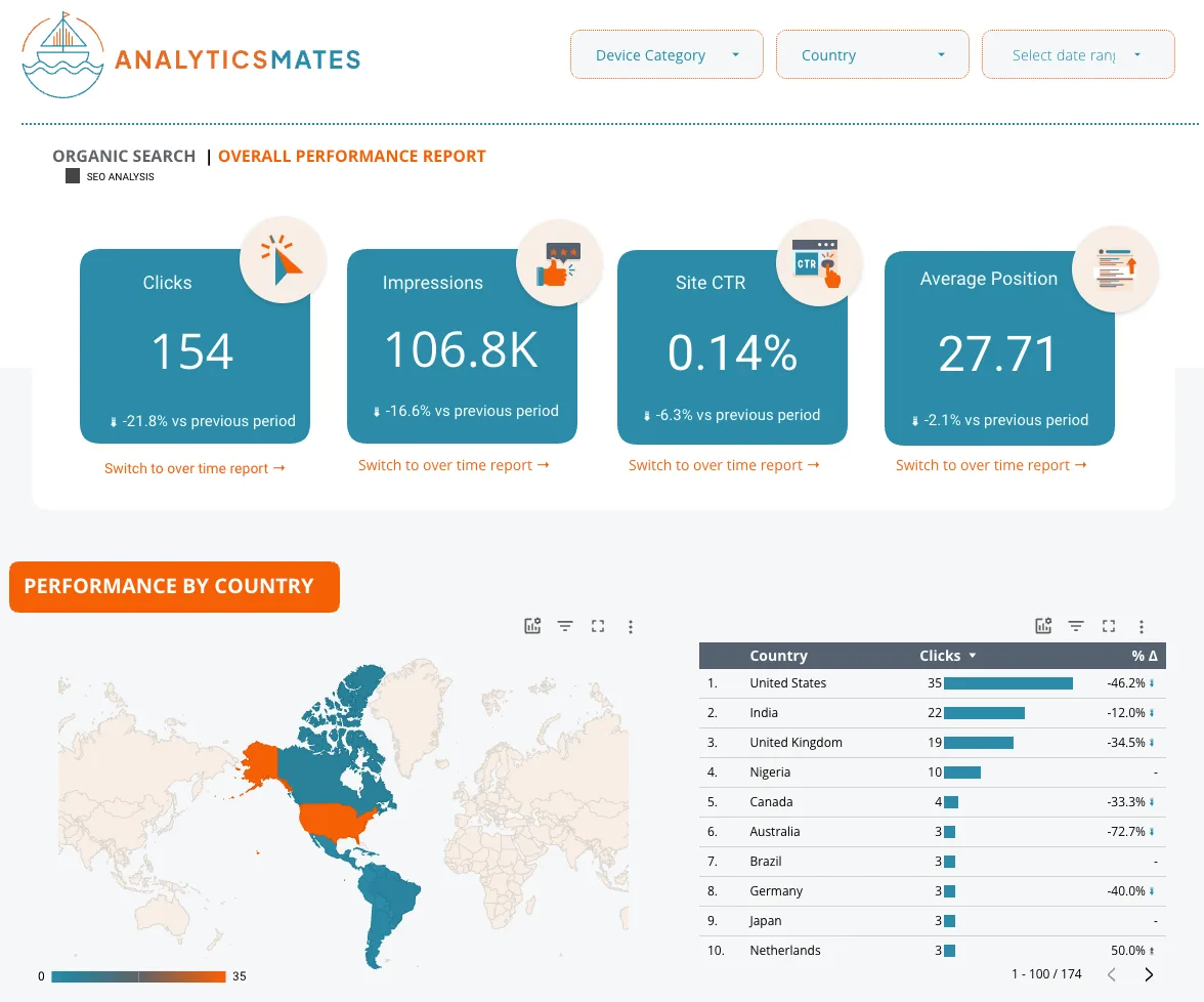
154 clicks. 106.8K impressions. 0.14% CTR. Average position 27.71. All down versus the prior period. United States 35 clicks. That page is Search Console. GA4 Dashboards cannot produce it.
The same split shows up in GA4 reporting itself. Native Dashboards give you a pulse. A stakeholder report still needs pages, filters, and a layout someone can read without us on the call.
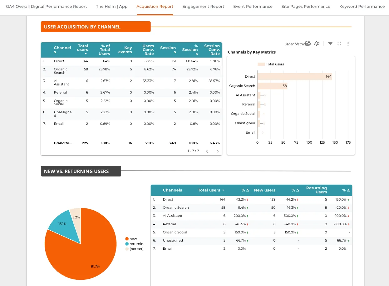
That is our GA4 Overall Performance template in Looker Studio — KPIs, trends, channels, landing pages, conversion views in one reporting experience. Not a recreation of every GA4 screen. A structure around the questions people ask when they review digital performance.
We also still use Looker Studio when the audience is the quarter, not the Monday standup. Our QBR template is organized around the conversation a team needs to have every three months: what changed, where, and what to investigate next.
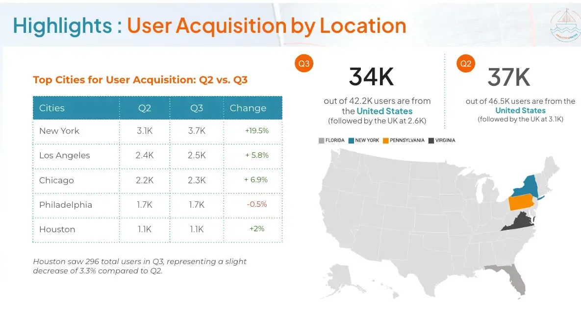
A native GA4 dashboard does not do that job. It was not supposed to.
Templates are a starting point, not the finished product
We like templates because they save time and give a proven structure. They go wrong when the template dictates the measurement.
Start with a Looker Studio setup if you need the mechanics. Then change it. Redefine KPIs. Split traffic from lead quality. Add funnel stages. Bring in data GA4 cannot see. That customization is usually where the report becomes useful.
Browse the free GA4 Looker Studio templates. Treat them as a framework. Do not treat them as the answer.
Connecting GA4 to a dashboard tool is the easy part. The work is deciding what belongs, checking that the measurement underneath is sound, and shaping the page so someone can use it without an analyst sitting next to them.
Build the dashboard for the people using it
Another mistake: one report for everyone.
An analyst wants the detail behind a traffic change. A marketing manager wants channels, campaigns, conversions. An executive wants a handful of business outcomes and enough context to know whether something changed.
Cadence matters too. A Monday optimization view is not a quarterly explanation. If you publish one GA4 dashboard and send the link to the whole company, you have not built a reporting system. You have built a compromise nobody quite trusts.
What to do this week
- Build one native dashboard for the GA4 numbers you already check. Channels, key events, the two or three scorecards you open every Monday. Fifteen cards is plenty for that job.
- Write down the question it answers. If you cannot finish the sentence “this page exists so we can decide ___,” you are decorating, not reporting.
- Check the tracking behind the cards. Open one key event in DebugView or the Events report. If the event is wrong, do not publish the dashboard. Fix the event.
- List the sources the native board cannot see. Search Console, Ads, CRM, calls, revenue. If a stakeholder needs those, that report still belongs in Looker Studio.
- Do not give everyone the same link. Analyst view, weekly marketing view, executive view. Native Dashboards can cover the first. They rarely cover the third.
If you fix only one thing: stop treating a new GA4 canvas as proof that reporting is done.
So, are they enough?
For a lot of day-to-day GA4 work, yes. If you need a cleaner way to watch a set of GA4 metrics without jumping between reports, use it. We did.
For client reporting, and for any report that has to survive a meeting with someone who does not live in GA4, no. A chart is the visible part. Before that comes the unglamorous work: agreeing on the KPI, making sure it is tracked correctly, choosing the source, and deciding how much context the reader needs.
Some teams can now do most of the watching inside GA4. The showing — and the measurement underneath — is still the job.
If you want that as an operation — definitions, tracking, and a report people can actually use — start with Analytics & Reporting or book a consultation.
Work with us
Need this done for your property?
Analytics Mates handles GA4 setup, GTM implementation, Looker Studio dashboards, and the ongoing measurement operations that agencies and in-house teams don't have bandwidth for.