


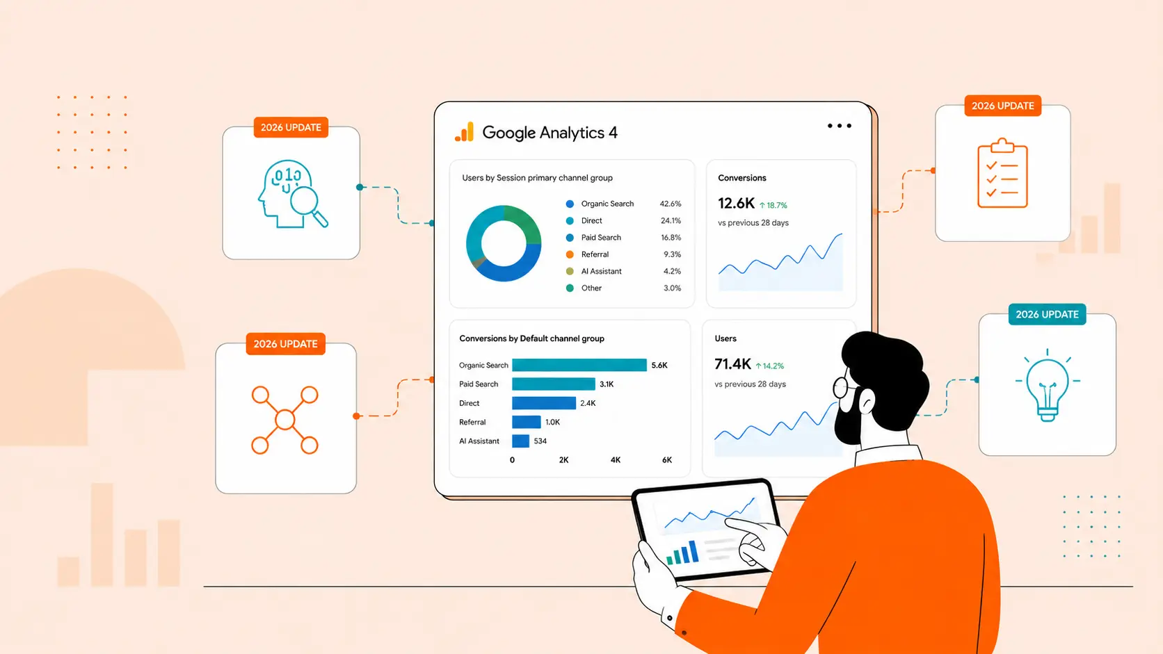


Let’s be honest - GA4 isn’t the easiest tool to wrap your head around. The interface is different, the metrics have shifted, and the default reports often leave you wanting more. Whether you're pulling data for a quick check-in or building out full client decks, it can take a lot of digging to get the insights you need.
That’s where AI tools come in. They're not here to replace your reporting skills but to help surface trends, clean up visuals, and even turn raw GA4 data into something you can actually talk about in a meeting. In this post, we’ll walk you through how several free AI tools handle the same GA4 data, how their outputs compare, and how you can plug those results into your existing workflow... without getting too technical. Let’s see what these tools can really do.
The Test Setup: Extracting Data from Google Analytics 4
Too much introduction isn’t our style... so let’s get right to the point.
This post is here to help you make more informed decisions when it comes to using AI tools alongside Google Analytics 4 (GA4). The goal isn’t just to show off what these tools can do, but to walk you through how they can support and enhance your reporting - not replace your critical thinking.
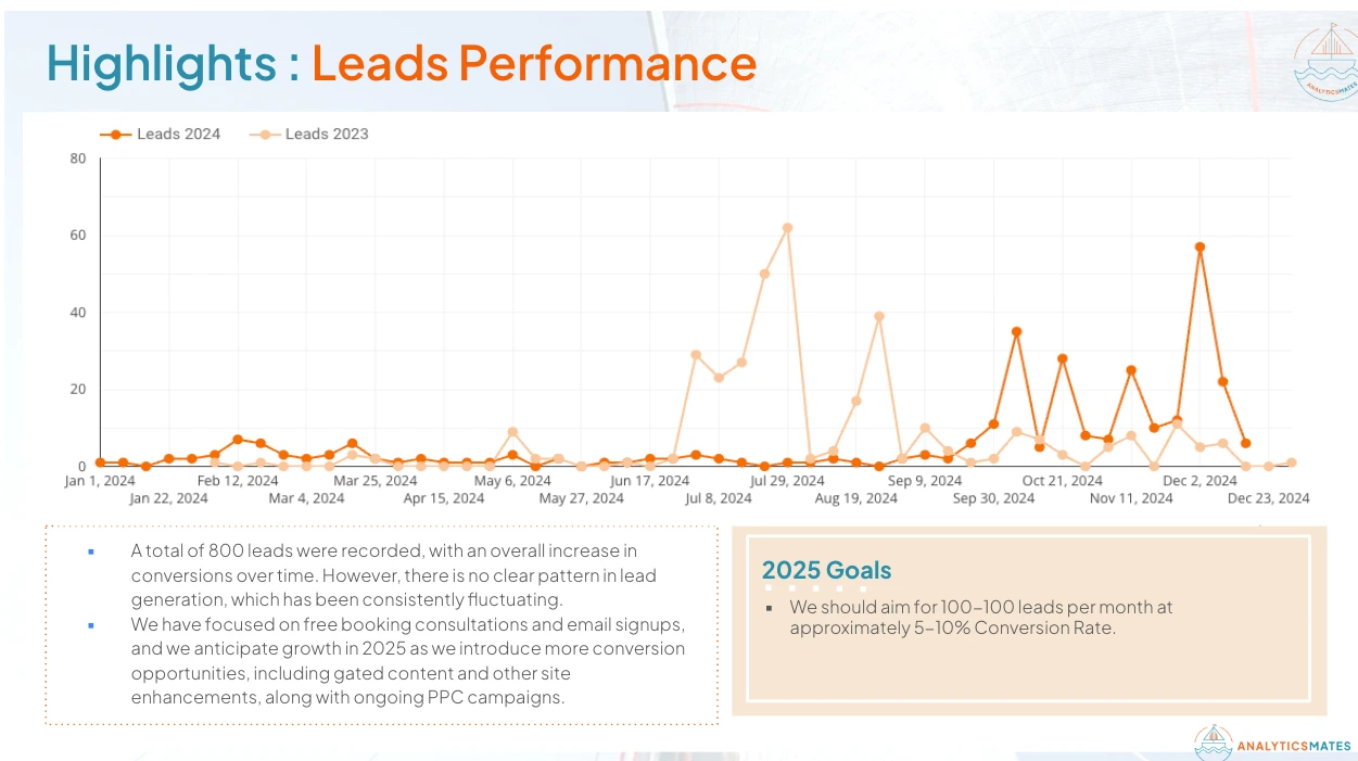
Say you’re putting together a monthly report for your boss or team. One thing they’ll probably ask about is where your leads or signups are coming from. Are people finding you through Google searches? Email links? Maybe social media or directly typing in your site? Showing this breakdown over time is super helpful - it tells you what’s working and what’s not.
Below, you’ll see a sample from our own Looker Studio Leads report. It’s a dashboard we update and monitor daily, giving us quick access to how well our GA4 channels are performing in terms of generating meaningful user actions - whether that’s completing a form, booking a consultation, or signing up for an email list.

This could be too technical for you and would not know where to start. Don’t worry it should be simple. Let’s begin with exporting the information that you need from your GA4 report. There are actually two simple approaches to do this.
Extracting Key Events Data: Using Standard Reports (Manual Export)
1. Go to Reports: In GA4, navigate to Reports.
2. Open Acquisition: Select Acquisition > Traffic acquisition (for session channels) or User acquisition (for first user channels).
3. Set Primary Dimension: Click dropdown, choose Session default channel group.
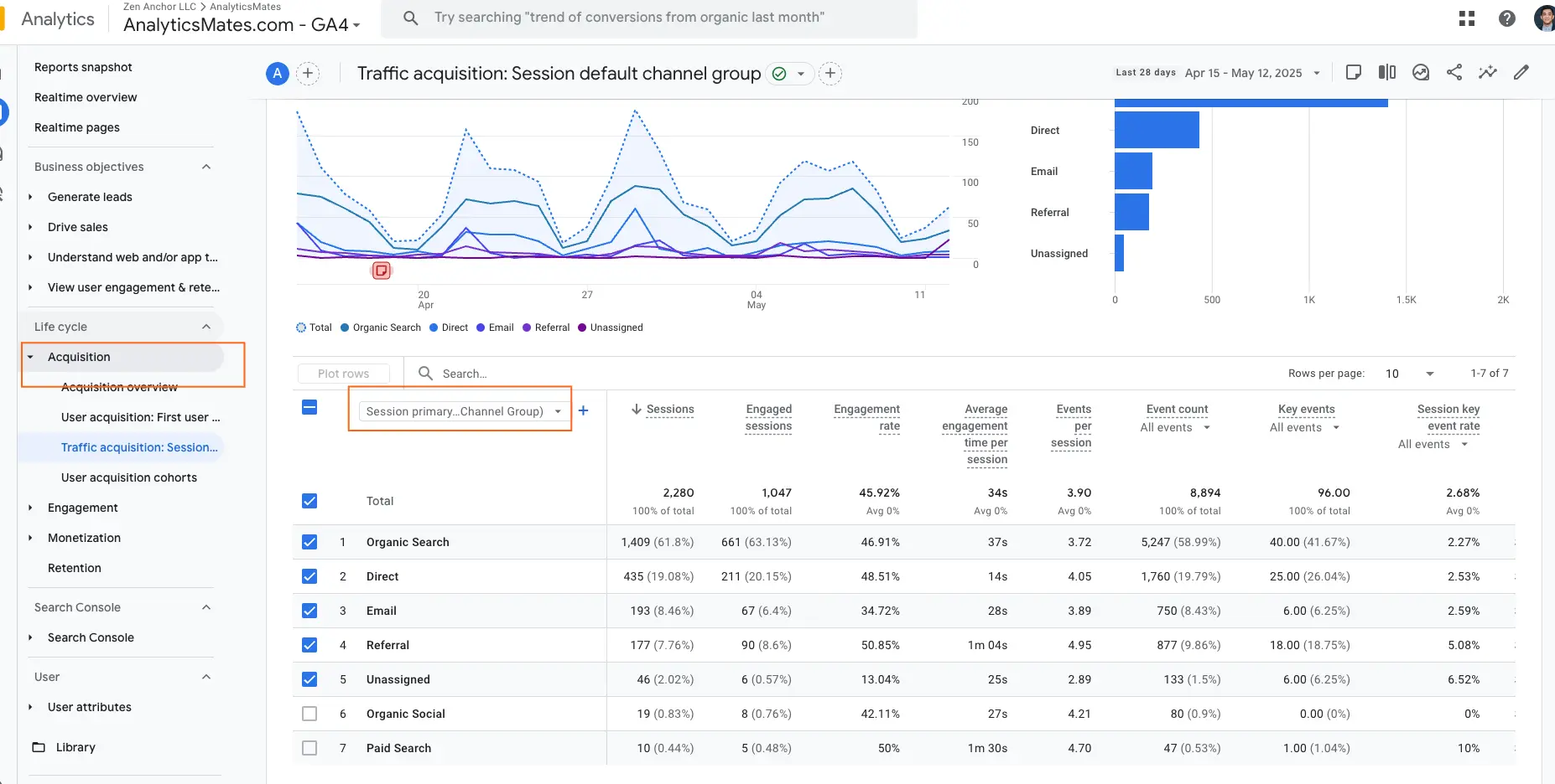
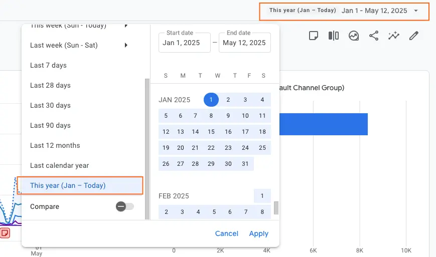
4. Set Date Range: Select the specific month you need.
5. Find the Key Events column and filter: Click dropdown icon, set Event name exactly matches your Key Event(s). For this example we chose “Email Signups”.
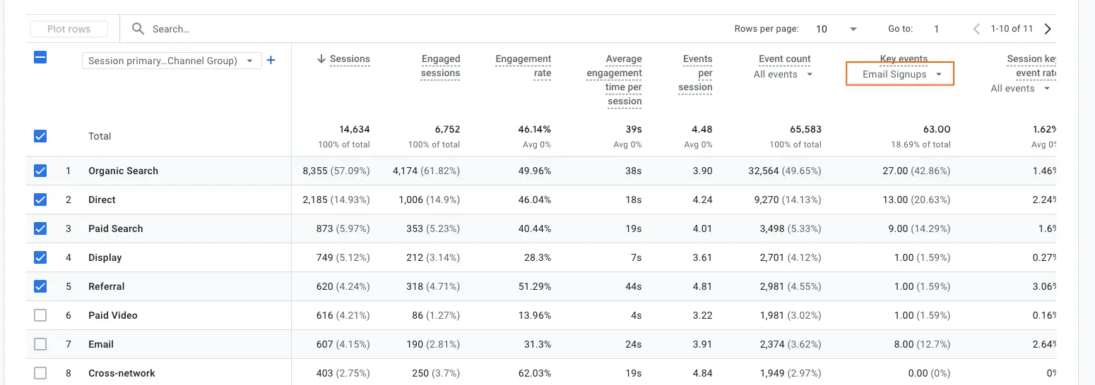
6. Now one of the most important dimensions to include here is the date. Since we want to get an insight about how these channels are performing on a monthly basis, it’s important to include the “month” as a secondary dimension in your report. → Click the plus icon “+”
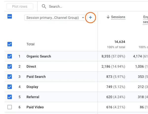
and look up for a Month.

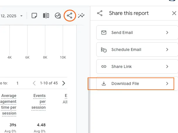
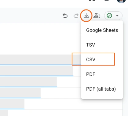
7. Export Data: Click "Share this report" icon (top right), choose Download file as CSV or Google Sheets.
Here’s the report for your reference: Analytics Mates: Sample Monthly User Traffic Report per Channel (Manual).
2. Extracting Key Events Data: Using Explorations (More Flexible)
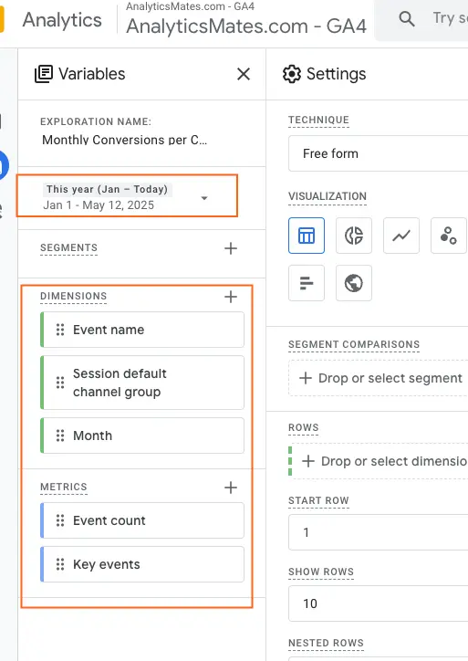
1. Go to Explore: In GA4, navigate to Explore.
2. Create New Exploration: Click + Blank report or a suitable template.
3. Add Dimensions: Import Date (or Month), Session default channel group, Event name.
4. Add Metrics: Import Key Events (or Conversions),or Event Count.
5. Configure Tab Settings:
- Drag Month (or Date) to Rows.
- Drag Session default channel group to Columns.
- Drag Key Events (or Conversions) to Values.
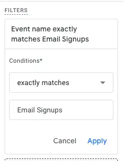
6. Filter for Key Events: In Filters, add filter: Event name exactly matches your Key Event(s).
7. Export Data: Right-click table data or use the export icon (top right of exploration), choose Export data as CSV or Google Sheets.
Here’s the report for your reference: Analytics Mates: Sample Monthly User Traffic Report per Channel (Explorations)
The Test Setup: The AI prompt
We now have the raw information that we need from GA4. Now in order for us to get the information that we’d want to capture from this raw data. We feed this data to an AI tool, and ask questions. So, we need valid questions to ask, so we came up with a simple prompt that we can use to get a better understanding of the report. Here’s an example:
I have monthly performance raw data (CSV) from Google Analytics 4 (GA4), showing how different traffic channels (like Organic Search, Direct, Email, etc.) contribute to key events such as this example 'Email Signup'. Please help me with the following:
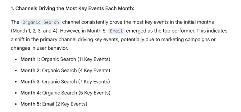
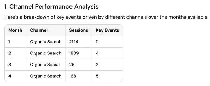
- Analyze which channels are driving the most key events each month.
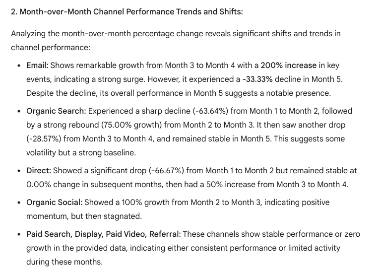
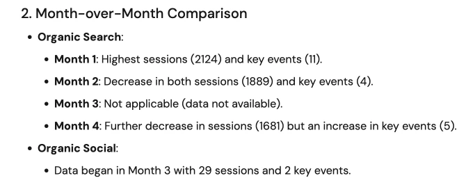
- Compare channel performance month over month to spot trends or shifts.
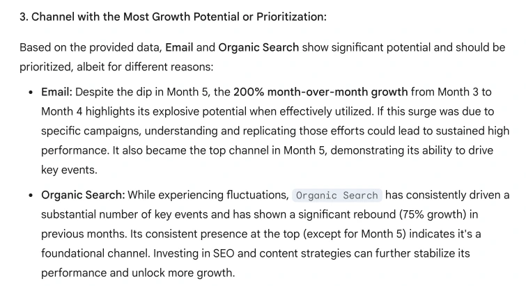
- Identify which channel has the most growth potential or should be prioritized for future efforts.
- Create clean, presentation-ready visualizations (such as bar charts, line graphs, or tables) that summarize the key insights from the data, and generate screenshot-style images or chart visuals that I can immediately use in a report or PowerPoint slide.
This prompt is just an example to help guide you - there’s no fixed rule or “right” way to write one for AI. What works really depends on what you're trying to find out. Feel free to shape your prompts around your own business needs and goals. For now, let’s test a few out and see how different AI tools respond.
The Test Setup: How We Compared AI Tools
Now, let’s take a look at how some of today’s most widely used AI tools respond to the same prompt. We’ve listed a few of the most popular options currently available in the market. While we won’t be walking through each step of the process in detail here, the general approach was straightforward: we uploaded the same CSV file into each tool and used the exact same prompt for consistency. Below, you'll find the responses each AI tool provided, which should give you a sense of how their outputs compare and where each one might shine depending on your specific needs.
Disclaimer: All of our feedback on these tools is based on our own experience and may differ from what other users encounter firsthand.
GPT-4 (OpenAI, via ChatGPT)
Here’s what the tool returned based on our input:
Note: Double-check that your data is clean and organized before uploading. A well-structured file makes it easier for the tool to interpret everything correctly.
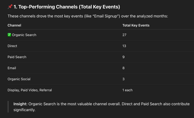
1. Top-Performing Channels (Total Key Events)
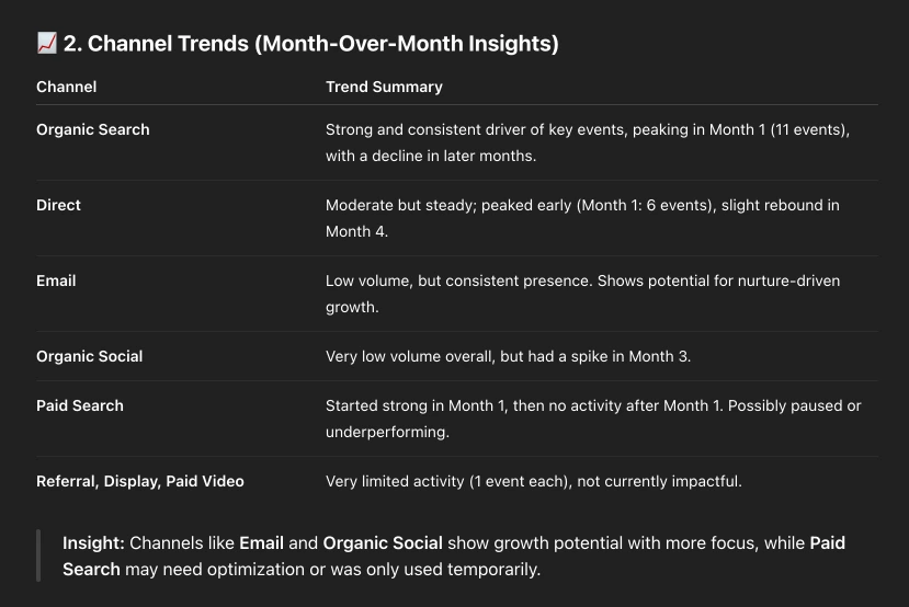
2. Channel Trends (Month-Over-Month Insights)
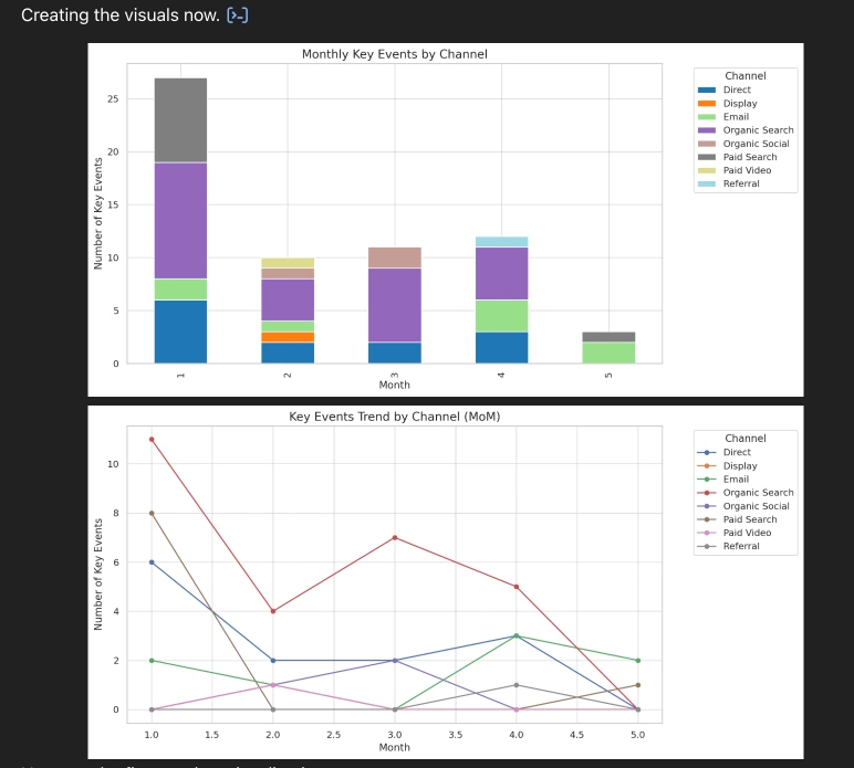
3. Visualization you can download
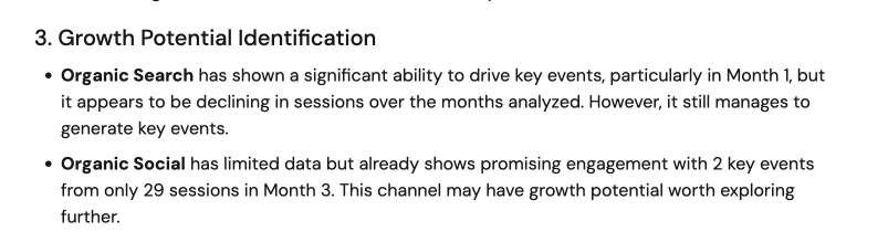
4. Growth Potential (Based on MoM Patterns)
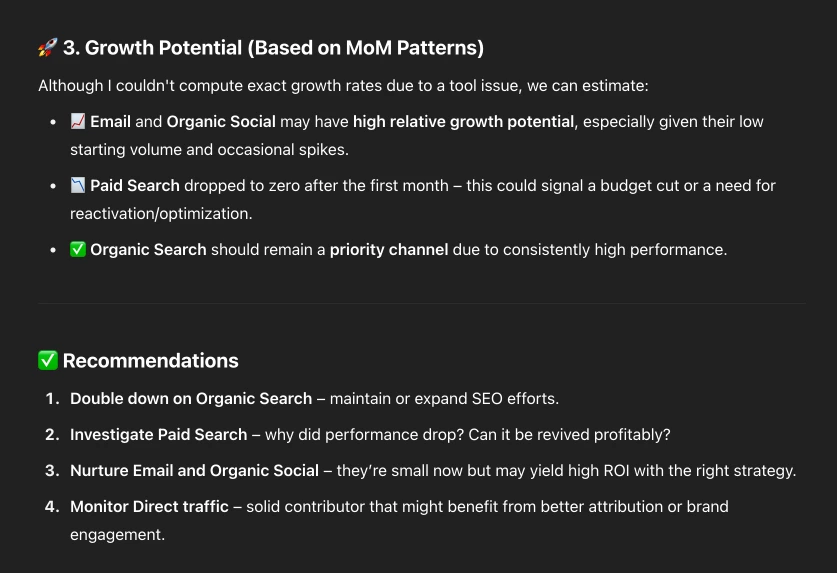
The process was straightforward, and the report delivered clear, accurate, and insightful analysis. The visualizations were well-presented, and the tool even went a step further by offering actionable recommendations.
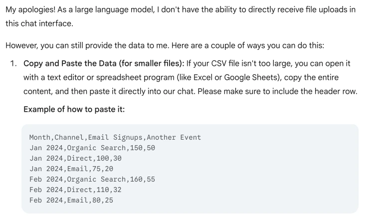
Gemini (Google)
This tool doesn’t support direct CSV uploads, so the best approach is to copy the data from your spreadsheet and paste it directly into the chat box.
1. Top-Performing Channels (Total Key Events)
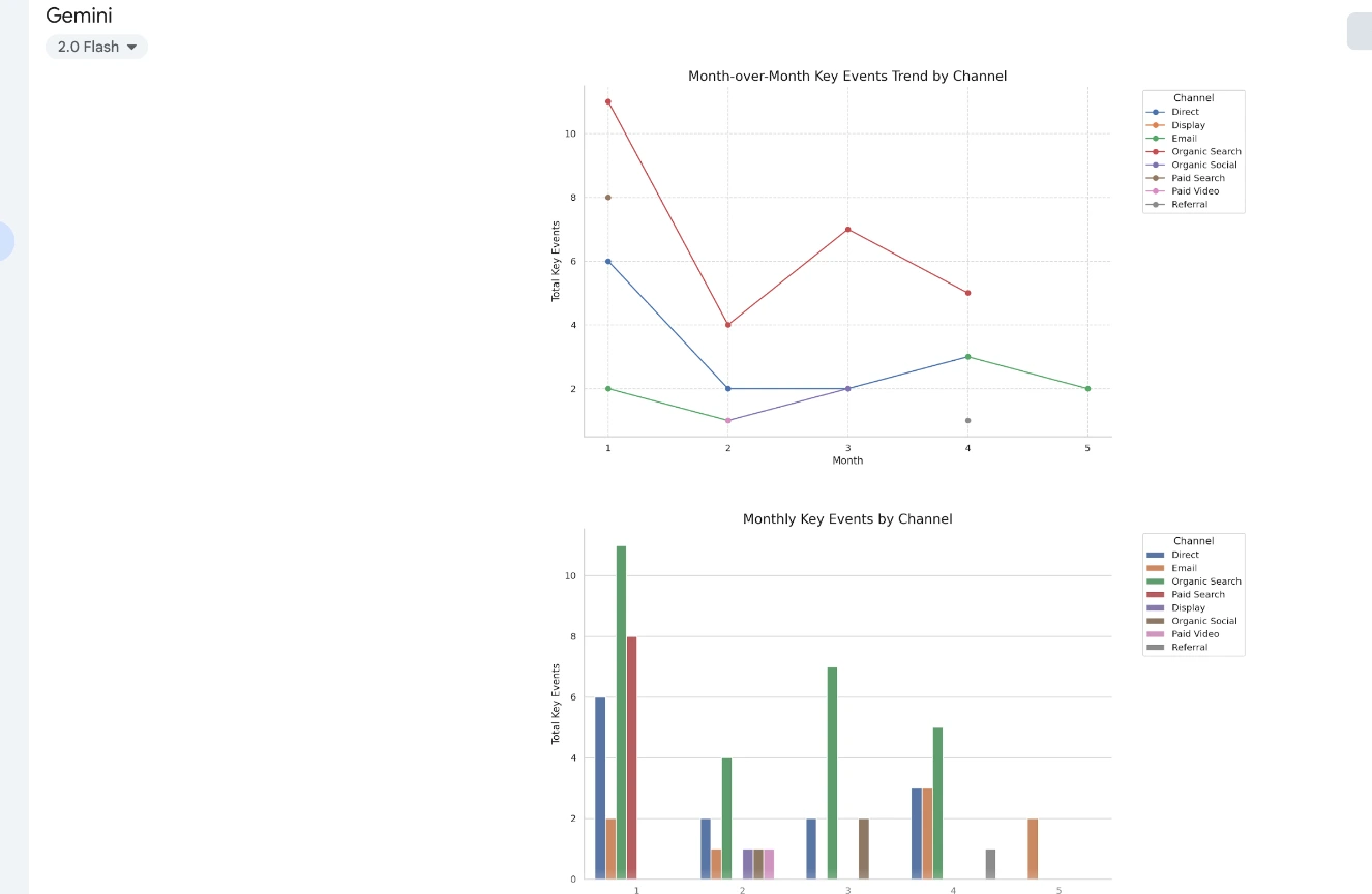
2. Channel Trends (Month-Over-Month Insights)
3. Visualization you can download
4. Growth Potential (Based on MoM Patterns)
Perplexity AI
You can upload a CSV file directly to this tool without a hitch. Just like with ChatGPT, it’s a good idea to tidy up your spreadsheet first - clean formatting will make it easier for the tool to review your data and respond quickly.
1. Top-Performing Channels (Total Key Events)
2. Channel Trends (Month-Over-Month Insights)
3. Visualization you can download

4. Growth Potential (Based on MoM Patterns)
Requesting support from this tool was relatively straightforward. The report it generated was acceptable, though not as detailed or in-depth as the other two tools we tested. It didn’t do as well when it came to building charts or graphs - the visuals were a bit basic compared to the others.
Before we wrap up, here’s what we want you to take away from this post:
This blog is meant to help you get started - especially if you're feeling stuck or unsure of where to begin. Whether you’re working on a one-off report to present to your team or boss, or building a recurring template like a Quarterly or Annual Business Report, the AI-generated outputs we've explored here can give you a solid foundation.
Still, don’t treat the results as the final version of your analysis. These tools are meant to support your process - not to replace your understanding of the data. Use them to double-check your numbers or to spot things you might have missed. You bring the context and expertise; these tools just help make the process a little easier.
We talk more about this in our other post: The Rise of AI: Threat or Opportunity for Data Analysts?
One last thing: the tools we featured here are based on our own testing and experience. You might find different results depending on how you use them, and that’s perfectly normal. What’s most important is that you find something that fits your way of working and helps you get to the insights you need.
There are plenty more tools out there worth exploring - we just covered a few to help you get going.
FAQs:
1. Can I trust AI tools to accurately interpret GA4 data for client reporting?
Generally, yes - but with caution. AI tools can surface trends and summarize patterns quickly, but they don’t always understand context or nuance. Always review their output with your own knowledge of the business and campaign goals in mind.
2. Which AI tool is best for non-technical marketers looking to simplify GA4?
Google Gemini and Claude tend to be more user-friendly and require less prompting. They’re great for summaries and explanations, especially if you're not into code or complex filters.
3. Do AI-generated visuals meet professional presentation standards?
It depends on the tool. Some can create clean, polished charts (especially if you’re using Excel with Copilot or ChatGPT with the code interpreter). Others might need a bit of post-editing before they’re presentation-ready.
4. How do I export GA4 data for use in tools like ChatGPT or Claude?
Go to your GA4 report, export as a CSV (or use Google Sheets), and upload that file into the AI tool (if it allows it). For tools like Claude or ChatGPT, you can upload the file directly if using their advanced features.
5. What are the risks of relying too much on AI for reporting insights?
AI can misinterpret data if the context isn't clear. It also can’t always distinguish between correlation and causation. Treat it like a helpful assistant - not the final voice on your data.
6. Are there privacy concerns when uploading analytics data into AI tools?
Yes, especially if the data contains sensitive information or user identifiers. Always anonymize your exports and check the AI tool’s privacy policy before uploading.
7. How do I verify if an AI tool's analysis is actually correct or useful?
Cross-check its insights with what you already know from GA4, and re-run the analysis using slightly different data sets or prompts. If something looks off, dig into the data manually.
8. Can I use AI tools without needing advanced prompt engineering?
Absolutely. Most tools work well with simple instructions like “Summarize this traffic data” or “Create a bar chart of top sources.” The more specific you are, the better the results - but you don’t need to be a prompt pro.
Final Words
Each tool we tested had its strengths, some made the data look great, others focused more on clear explanations. None were perfect, but each one had something that made the process smoother.
While no single AI tool is perfect, each brings something valuable to the table - some offer rich visuals, others excel at narrative clarity, and a few do both with minimal effort. The real power lies in using them as a complement to your own expertise, not a replacement. Pairing your knowledge of the business with the speed and insight of AI? That’s a winning formula.
Thank you for reading!
We're always looking for ways to improve our Google Analytics 4 blog content. Please share your feedback so we can make it even better.
See Article Images


