


Why we built The Helm
I’ve spent most of my career inside analytics tools. Sometimes as a builder. Sometimes as an advisor. Often as the person asked to explain why the numbers didn’t line up or why a decision still felt unclear after hours of reporting.
Across Fortune 500 companies and small teams, the pattern has been consistent. Google Analytics contains the data teams need, but the experience of using it makes clarity harder than it should be. The interface is dense. The reporting model is unintuitive. Even experienced teams rely on workarounds to answer basic questions.
When answers are hard to reach, judgment becomes inconsistent. When judgment is inconsistent, decisions slow down.
The Helm is our attempt to fix that failure mode directly.
The core problem with Google Analytics
Google Analytics exposes a large amount of data through a complex interface. The reporting model assumes users know where to look and how to interpret what they find.
In practice, most teams rely on secondary tools like Looker Studio or spreadsheets to make the data usable. Even then, the workflow creates friction:
- Time is spent finding numbers instead of interpreting them
- Different teams answer the same question in different ways
- Decisions depend on who built the report, not on shared understanding
Most analytics tools stop at access. They assume users can supply the context and judgment themselves. That assumption breaks down quickly.
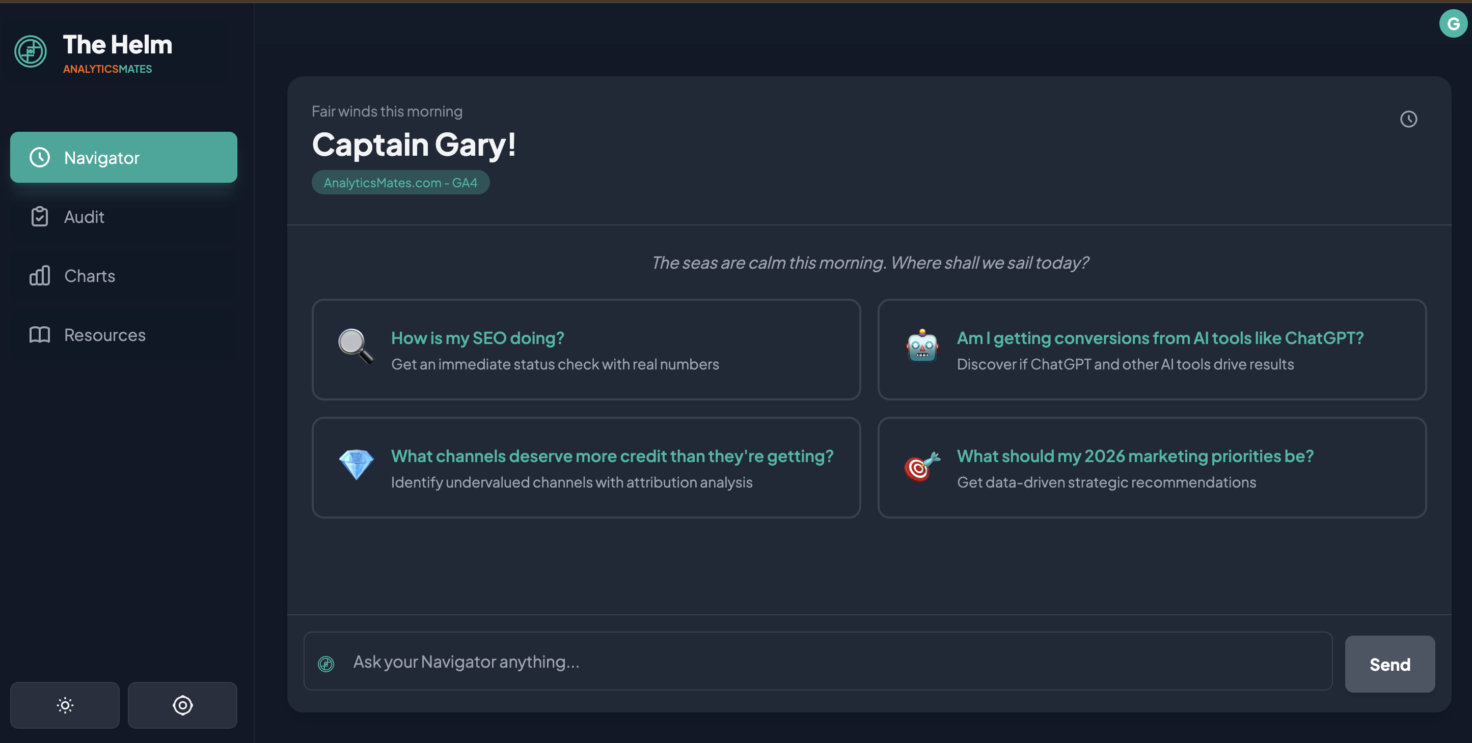
Navigator: AI analytics answers with context and judgment
The pain point
Asking a simple question in Google Analytics often requires multiple reports, filters, and assumptions. The effort discourages exploration. Teams default to the same views, even when conditions change.
How Navigator works
Navigator provides a natural-language interface to your analytics data. You can ask direct questions about changes, trends, and performance without navigating the reporting interface.
Navigator returns:
- What changed
- When it changed
- How large the change was
- Why it is likely happening
Responses include reasoning and uncertainty when the data does not support a confident conclusion.
What makes it different
Navigator does not stop at retrieval. It prioritizes findings based on patterns observed across real analytics implementations. The goal is to surface what deserves attention, not everything that changed.

Audit: Google Analytics data quality and tracking review
The pain point
Many teams are unsure whether their analytics data can be trusted. Events are missing, duplicated, or poorly defined. Business-critical actions are often measured inconsistently. Traditional audits are static documents that become outdated quickly.
How Audit works
Audit evaluates your analytics setup continuously. It checks for:
- Missing or incomplete event coverage
- Inconsistent naming and definitions
- Misalignment between tracking and business goals
- Configuration issues that lead to misleading data
Findings are ranked so teams know what to address first.
What makes it different
Audit is connected directly to analysis. When Navigator identifies a questionable trend, Audit can explain whether tracking quality may be contributing to the result. This reduces guesswork and prevents action based on unreliable data.

Charts: Analytics charts designed for decisions
The pain point
Dashboards tend to grow without restraint. New charts are added to answer new questions, but old charts remain. Over time, signal is buried under volume. Most dashboards describe activity. Few support decisions.
How Charts work
Charts in The Helm are limited by design. They focus on:
- Meaningful changes
- Directional movement
- Context around anomalies
Charts exist to support explanations rather than replace them.
What makes it different
Charts are not the product. They support analysis instead of competing with it. If a chart does not help explain a change or support a decision, it does not belong.

Resources: Analytics implementation guidance and fixes
The pain pointEven when teams identify an issue, execution slows down. Questions about tracking standards, implementation details, or best practices delay action. Documentation exists, but it is rarely consulted at the right moment.
How Resources work
Resources provide practical guidance tied to real analytics workflows, including:
- Tracking frameworks
- Measurement definitions
- Common implementation fixes
- Reference examples from past work
Resources appear when they are relevant to the analysis being performed.
What makes it different
Resources are part of the workflow, not a library to browse. The goal is to remove friction between insight and action.
How The Helm fits into an existing analytics stack
The Helm operates on top of Google Analytics. It does not replace your data source or reporting infrastructure.
Its role is to reduce friction, add context, and support decisions when the underlying tools fall short. Each feature exists to address a specific failure we have seen repeatedly in real teams.
Where this goes next
We did not build The Helm to compete with dashboards or replace analysts overnight.
We built it because too many teams were stuck between data and decisions, relying on workarounds that did not scale. The product reflects problems we have seen repeatedly and solutions we have implemented by hand for years.
The beta is open so we can test this approach with real usage and real constraints.
If Google Analytics feels harder than it should, or if decisions stall after reports are delivered, The Helm may be useful.
Join the beta:
https://app.analyticsmates.com
See Article Images


